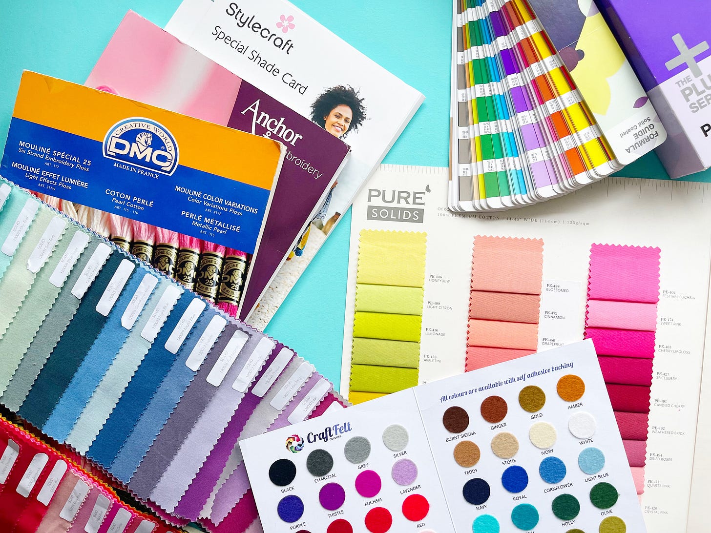
For a long time now, I’ve had a bit of an obsession with colour charts. As I’ve experimented with different craft mediums over the years, the number I have has steadily grown as I’ve tried out new supplies, to the extent where I can now probably call myself a colour collector.
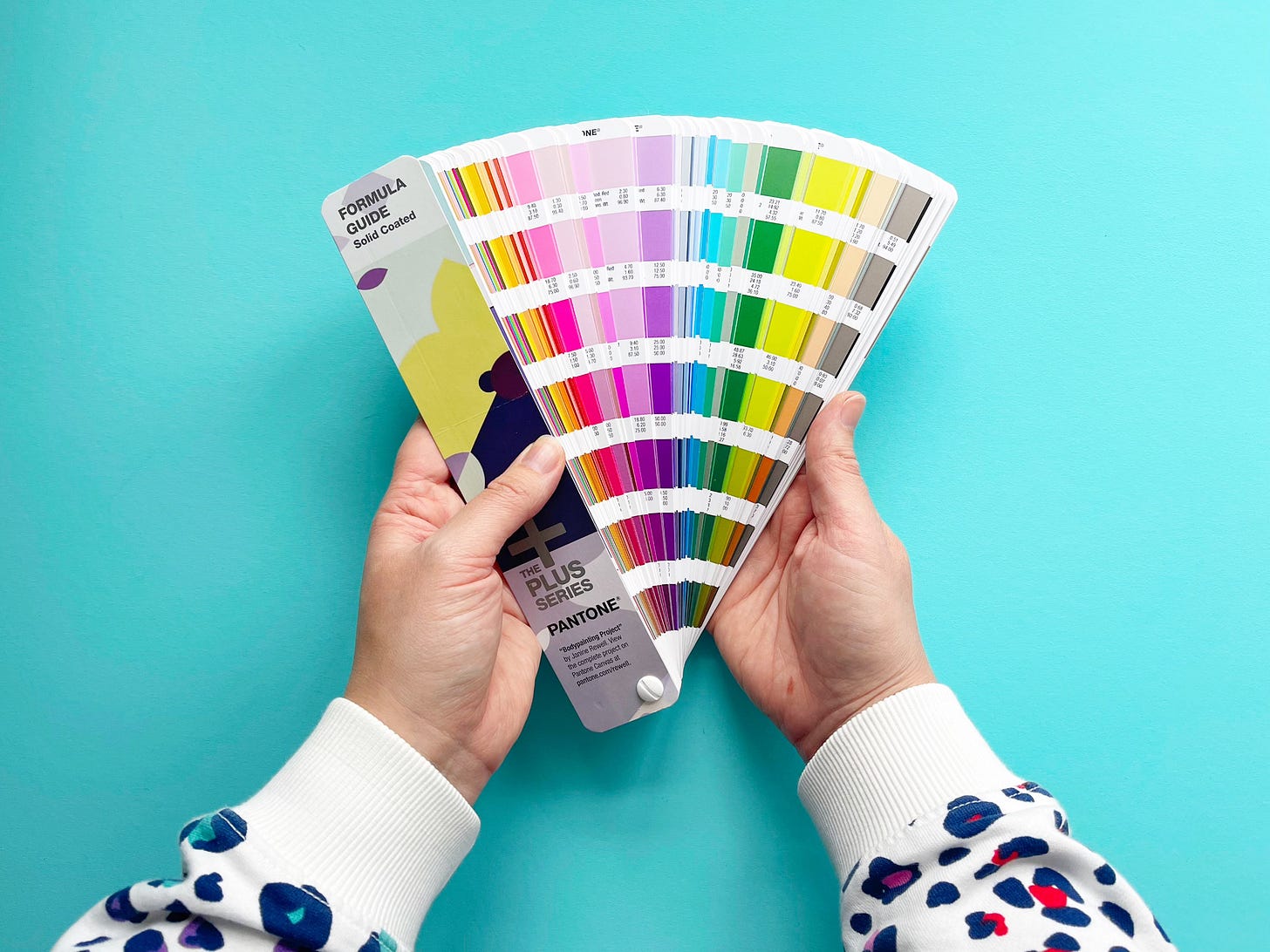
My friend Amy recently posted that she was selling her Pantone Formula Guide, and when I dropped into the comments to ask about it she just said “think of the photos!”. She knows me well, and to be honest I was already there in my head, dreaming of creative flatlays and colour combinations galore. As you can see from the main photo at the top of this post, it was quickly added to my collection!
After sharing a photo of my Pantone colour chart curtains that I made a few years ago, I know I’m definitely not the only person who is taken by them. As I carefully flicked through the colours of the Pantone guide I found myself wondering just what it is that makes colour charts so appealing? Why do we love them so much?
As a colour lover, it’s obviously wonderful to see so many colours in one place on a colour chart, so the visual appeal is very clear. One of my favourite things about holding a physical colour chart in your hands is that it really brings the creative possibilities to life. The combination of colour and the materials, whether it’s thread, fabric, or yarn, makes it even more special. But when I started to think about why we love them, I wondered if there’s more to it than this.
In the introduction to the Pantone Formula guide, this definition of Pantone colours caught my eye:
“[Pantone is] the international colour language that is used for design, print, packaging, and other industries where accurate colour communication is crucial.”
(Pantone, 2016).
The key words here are language and communication. It’s not just about being able to communicate an exact colour in the Pantone system though; we communicate through colour on a daily basis, perhaps without realising it most of the time. It’s technically called ‘chromatic communication’ and it’s non-verbal, so we interpret colours as part of messaging.
I’ve always loved colour, but in writing this post I realised that I’ve never really sat down and thought about what I’m trying to communicate through colour in my embroidery designs. I’m not sure if that matters or not, so that’s something for me to continue to ponder I think. But I’ve always thought of colour as being one of the key elements in my work, so I try to add as much of it as possible. Even with a limited number of colours in a palette, I usually choose colours that are bright, fresh and fun.
In a review of my first book, Colourful Fun Embroidery, I remember someone saying that (and I’m paraphrasing here) all the colourful designs make this a really great book for kids. It perfectly summed up that feeling that anything colourful is for children, and I’ve always been a bit irritated by this opinion if I’m honest. There’s nothing that makes a colour more ‘grown up’ than another - all colours are for everyone. Just like my book, which wasn’t actually aimed at children (but I would always encourage them to give it a go!).
We make choices to dress in certain colours, to decorate our homes in a palette we love, and they’re just two of the ways in which we reflect who we are. As we grow up we can lose that sense of playfulness when it comes to colour, and perhaps that’s where the idea of ‘grown up colours’ comes in. Maybe it’s not about the colours themselves, but choosing or feeling the need to conform so that we don’t stand out too much?
So I wonder if having all of the colour choices set out neatly in rows on a colour chart actually subconsciously shows us potential and possibility? Not just through a creative project but in life generally too?
It feels hopeful to me to know that there are so many possibilities, and that we can reflect so many different aspects of ourselves and our lives through colour. On a colour chart, the options are all there for us to see. We won’t ever choose all of the individual shades, and there are some that we’ll naturally navigate towards, but the choice is ours.
Sometimes the sheer number of possibilities in life can feel overwhelming, but the colour chart shows us that even with so many options to work with we can narrow it down to a certain shade. We can make our own choices, even if that takes time. From there, we can go further towards selecting the best option for us, whether that’s an individual colour or a palette. Focusing on one individual choice or seeing the bigger picture, depending on what we need in that moment.
Life is full of decisions and we have to make choices on a daily basis. We have those we make about things we love alongside some that we don’t, and sometimes we might make the wrong choice. Those things sit side by side, just like the colours on the colour chart. We can always choose another colour.
But what about the neatness and order of the colour chart? I initially wondered if the neat rows were a symbol of conformity again, but then I remembered that it’s through the creative process that we give ourselves permission to break free from the rules.
We choose the colours from the chart and effectively break them out of the rows, experimenting with them in so many different mediums and using them to express ourselves in a way that is unique to us. I think there’s something magical in how we use this as a way of communicating, and perhaps that’s the reason that we love the colour chart so much.
I’d love to know your thoughts on this, so leave a comment below or like this post if you enjoyed reading ❤️ If you’re a colour lover like me then you might enjoy taking time to look at these links:
❤️ Find out more about the symbolism of different colours here.
🧡 Join in with a fun 30-day colour therapy challenge from colour therapist Momtaz Begum-Hossain.
💛 ‘Chromatic’ by Shane Griffin via TED - a short visualisation of colour as light passes through defective glass.
💚 See how the cuttlefish can change colour to hypnotise crabs in this clip from David Attenborough’s Blue Planet II.
🩵 I recently discovered
by Vanessa Edwards, which is ‘an exploration of joyful colour palettes’ using AI as well as Vanessa’s inspiration. I initially read this post about her colour hunting in Brussels, which is fabulous!💜 Learn a bit more about how colour has been used in art throughout history here.
If you’ve enjoyed reading this post, then why not get the Substack app? It’s easy to use, and there’s the option to receive notifications about my new posts via the app instead of email.
If you no longer want to receive my posts via email, you can unsubscribe at any time by clicking the link at the end of the email.


Thank you for this article, it's wonderful to read about colour. As a designer, you can imagine I'm a little obsessed with paint charts too. So many possibilities!
All the colours, all the time. I'm like a walking colour palette and I take great delight in it. A friend once said to me 'you dress so joyously'. I embroider in the same way. My friend once told me that I dress like an unafraid toddler. I could have taken offence, but quite frankly childhood is something many of us long to return to. Simpler days filled with persistent pockets of excitement, laughter awe and wonder. That 'oohhh ahhhh' of a colour combo bestills my beating heart. I think colour is often feared by people, colourful choices often bring great bravery and great joy in equal measure. Often a sign of someone who is comfortable and confident not be correct all of the time and see opportunities to grow from what others would see as failure. Colours are brave, bold and beautiful.